

There is a notion that is accepted by many people that certain colours can evoke certain moods, which is reflected the field of ‘colour psychology’. Although to a certain extent colour preference and meaning is subjective, based on factors such as culture or personal experience, there are some universal meanings associated with colours. This concept highlights the importance of selecting the right colour when painting a room in your home, as you will be surrounded by these colours chosen each and every day.
As a general tip, warm colours such as red, orange and yellow are known for their cozy effects and can be best used in rooms that have little natural light. In contrast, cool colours like blue, green and purple are relaxing and may make the room feel colder, so are best used in rooms that do already benefit from natural light.

Neutrals
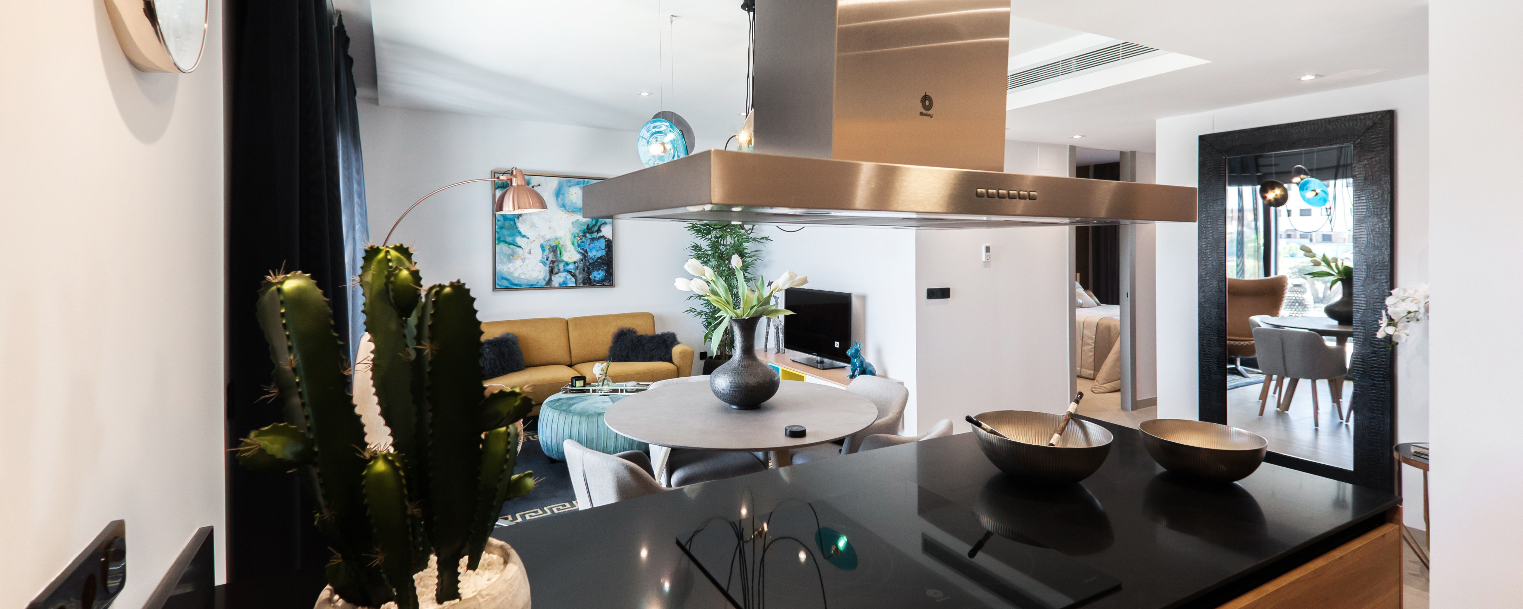
Neutrals such as black, white, greys and beige are fantastic colours colours to use when primary colours are not a preference for the homeowner and they want to create a more timeless atmosphere in the home. Black is often associated with feelings of sophistication or mystery, so can be a great feature or accent colour to add depth, but too much black can make a room feel a bit too serious. White is a wonderful way to elicit a peaceful mood and is perfect for making a room appear larger. Grey works wonderfully to ensure a room feels simple and stylish and evokes a sense of calm. Beiges can elicit a cosy and comfortable mood, which makes it a perfect choice for any room, especially the living area and bedrooms. There are several reasons why choosing neutral shades is an awesome trend.
Red
Red has been associated with a variety of moods, including irritability and rage on one end of the spectrum, but may also create a sultry feeling and is known to make people appear more attractive. It is not recommended to paint a whole room red, but instead could be better used as a feature wall in the bedroom to promote feelings of sensuality.

Need a hand?
Bring your project to life with trusted pros.
Tell us a few details about the job and we'll match you with verified professionals in minutes—any trade, any project.
Orange
Orange is identified as being a fantastic booster of energy and excitement levels. The bright, popping colour is best used in spaces in which you need to be most productive and energetic, so would be a perfect choice for rooms such as your home gym.

Yellow
Yellow is usually seen as a cheerful colour, and reminds us of sunshine. Its uplifting effect can be best utilised in spaces such as the bathroom or even the kitchen, as it is also believed to stimulate appetite. Choosing yellow for larger spaces such as the living room is generally not recommended, as in large doses yellow may create feelings of frustration, and many people do not like yellow as a central decorating colour.

Green
Green has been known to elicit a calming effect on the mood, and it is considered the least straining colour on the eye. It is also associated with encouraging creative thinking. Green is therefore a fantastic choice for painting the study or studio space, or even the living room to promote relaxation.

Blue
Well known for its calming effect and association with relaxation and serenity, blue is a very safe choice for many areas of the home and can be easily used in larger amounts when soft shades are chosen. It is therefore especially suitable for the bathroom, bedroom or living room to promote this relaxed mood. Darker shades of blues should only be used sparingly, as it can sometimes be considered to represent feelings of sadness.

Still deciding?
Ready to compare quotes?
Tell us a few details about the job and we'll match you with verified professionals in minutes—any trade, any project.
Purple
Purple is often related to feelings of luxury and sophistication. Think of the cliché film featuring kings and queens enveloped in royal purple robes and their castles luxuriously decorated with velour purple drapes! This sophisticated feeling is best utilised by placing rich purples in the dining room or home office, or as a feature in the bedroom. Lighter purples elicit a similar calming effect as soft shades of blue, so can be used as a wonderful alternative.
Pink
Pink has been associated with feelings of sweetness, love, and a lack of aggression. Although many people would be opposed to including pink into their colour scheme when painting their home due to the Western social construction of it being “girly”, due to the positive effects it has on mood it can be a beneficial colour to include in the bedroom or perhaps the kitchen.

Selecting the colour of a room is very much a reflection of one’s personality, but keeping these tips in mind when painting your home will help ensure you elicit the desired moods when your family and guests are enjoying the space that you have created.
Need a Painter? Contact the perfect local professionals for all of your trades and service needs today.
Need a hand?
Bring your project to life with trusted pros.
Tell us a few details about the job and we'll match you with verified professionals in minutes—any trade, any project.