Each colour has a different meaning and there is an entire branch of psychology that explains colour features. Interior designers have a great responsibility to suggest and apply pleasant colours to your home because this is where you spend most of the time. In this article, I will explain what every colour means and how to arrange your flat in that regards.
Practical colouring tips
Each colour creates an association with a specific reaction that our brain has when we internalise it. If you want to know more about how people react to certain colours and the way you can use it in your home, check out our tips.
Use complementary colours
Different colours bring your flat various emotions and energies and you don’t want to make too extravagant combinations. It would be wrong to create the mixture of totally opposing visuals within the apartment. Therefore, you should choose colours that make a nice combination. These could be complementary colours such as blue and orange or red and green. You can combine them throughout the flat and establish a beautiful interior.
Dark vs bright
Maybe you love black or enjoy looking at white walls. But prior to making a decision about interior design, keep in mind that dark colours make your premises look smaller and sometimes even claustrophobic. On the other side, bright colours will make your home look much bigger and spacious. If you don’t have a huge apartment, always go for the brighter options.
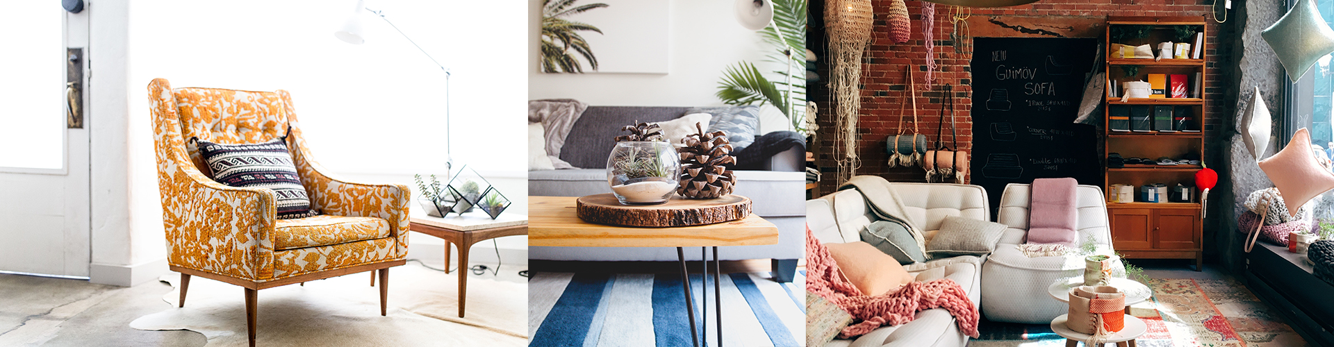
Living room
Now that we know some general colour features, we can go on room by room. The living room is the centre of your home and the place where you hang out with family and friends. Therefore, it should encourage communication and good mood with bright colours such as beige, orange, or yellow. It will make you feel comfortable, relaxed, and willing to talk.
Kitchen
This is another part of the flat that gathers family members. You can use pale shades of brown to decorate kitchen because it fits the wood elements and also creates more natural, almost outdoor, atmosphere. My experience in interior design even shows that people usually choose their favourite childhood colours for the kitchen, thus giving it the tone of security and warmth.
Need a hand?
Bring your project to life with trusted pros.
Tell us a few details about the job and we'll match you with verified professionals in minutes—any trade, any project.
Bedroom
The bedroom is the place for relaxation and joy. Bearing this in mind, you should choose warm colours such as green, blue, or lavender. These tones calm people down and give them the feeling of pleasure. It’s almost like a meditation room, so it requires peaceful tones and tranquillity.
Bathroom
This room is the symbol of cleanliness and purity, which is why white dominates bathrooms worldwide. White colour proves that your bathroom is hygienic, fresh and clear. It reveals potential stains and dirt, while perfectly white bathrooms suggest that everything is alright in there.
Home office
If you do a lot of work from your flat, you probably have a cosy home office. This place should be very comfortable, with visual details that allow your eyes to take some rest and enjoy the break. Green is the most common colour in home offices due to its warmth, so you should add such elements to your interior. Furthermore, you can add a few plants to make it look more natural but don’t exaggerate and turn the home office into the botanical garden.
Workout room
The workout room is where you want to feel strong and boost energy. In order to achieve this, colours such as red or yellow can really help you. Red can increase your blood pressure while working out whereas yellow is the colour of confidence and optimism. If you adopt them, training sessions will become much better.
Colours to avoid
There are colours that just don’t fit certain homes or at least rooms. Here they are:
Still deciding?
Ready to compare quotes?
Tell us a few details about the job and we'll match you with verified professionals in minutes—any trade, any project.
Purple: Although it can seem romantic and exclusive, purple is essentially a dark colour and doesn’t fit interior design well.
Yellow: Avoid this colour in your bedroom as it can often cause anxiety, which is not something you want in this type of room.
Black: This is never a good option because it gives the illusion of smaller space and also boosts depression.
Although it seems impossible and counterintuitive, colours can really change peoples’ moods and feelings. This is very important for interior design solutions as you need to choose the colours that match your preferences, temper, and personality. Your everyday surroundings have the biggest power to affect your behaviour, so keep an eye on my practical suggestions while decorating your home – it will make you happier and more energised.
Laura Buckler is a part-time writer at College essays scholaradvisor and blogger who loves writing about the psychology of colours and their combinations. She is the mother of two lovely kids but still finds enough time to help others with solving different problems.
If you're looking to change your interior colour, compare multiple quotes from professional painters today.
Need a hand?
Bring your project to life with trusted pros.
Tell us a few details about the job and we'll match you with verified professionals in minutes—any trade, any project.